
I guess I’m a little bored tonight because I got to thinking that I need to air my opinions about hockey team logos. With the beloved hometown team- the Winnipeg Jets- in the playoffs for the first time in 19 years, I’ve been following hockey more closely than usual. However, I still haven’t been watching closely enough to offer any sort of insight on all the sticking and skating (those being the technical hockey terms, as I understand them). So instead, I’m going to offer my incredibly worthy opinions* on the logos of the playoff teams, in a sporty bracket format, to decide WHO. WILL. WIN. THE SAMLEY CUP™!
*** Overblown design montage, logos swishing in to the sounds of a heavy metal rendition of the Hockey Night in Canada theme here ***
WARNING! HOCKEY LANGUAGE!!!
St. Louis Blues vs. Minnesota Wild

ST. LOUIS – A flying musical note? Really? Come on now with that, St. Louis. I’m a musician and even I can’t get down with that. When it comes to sportsing, I certainly don’t want to get pumped up to the sounds of Muddy Waters. Jock Jams, he ain’t. Though I do like the mental image of Little Milton hovering in on angels wings to score a game-winning goal…
MINNESOTA – At first I didn’t get the Wild’s logo. What is that supposed to represent anyway, camping? So I was busy lamenting why they didn’t just use a wolf or something when I finally bothered to look closer and I saw the animal head silhouette. I guess it’s a bear? Regardless, that’s some next-level, Fed-Ex logo shit right there. They even threw in a jaggedy shooting star and a spooky moon for that extra intimidation factor that you might not have gotten from the mystery bear.
WINNER: MINNESOTA WILD
Both logos are fairly tightly designed and tidy, but I’ll hand it to the Wild for the toughness factor. Blues music and hockey make for a weird combination. Props to the Blues though because I don’t know what I would’ve done with it if it were my design job anyway.
Nashville Predators vs. Chicago Blackhawks
 NASHVILLE – Look at this majestic, threatening logo. A nearly perfect specimen. Menacing, bold and at a nice slant to indicate speed. This animal may be extinct but it will fuck you up, son. On the ice, of course, both prehistoric AND modern day.
CHICAGO – Hahahaha, I’m not dealing with this one, I’m not an idiot. Though I do appreciate how bemused the dude looks despite the face full of probable sabretooth spittle. Disqualified.
WINNER: NASHVILLE PREDATORS (by default)
I like Chicago a lot as a team but come on, both their team name and logo are a sweaty smelling hockey bag full of “Nope.” Nashville moves on to a better match-up next round.
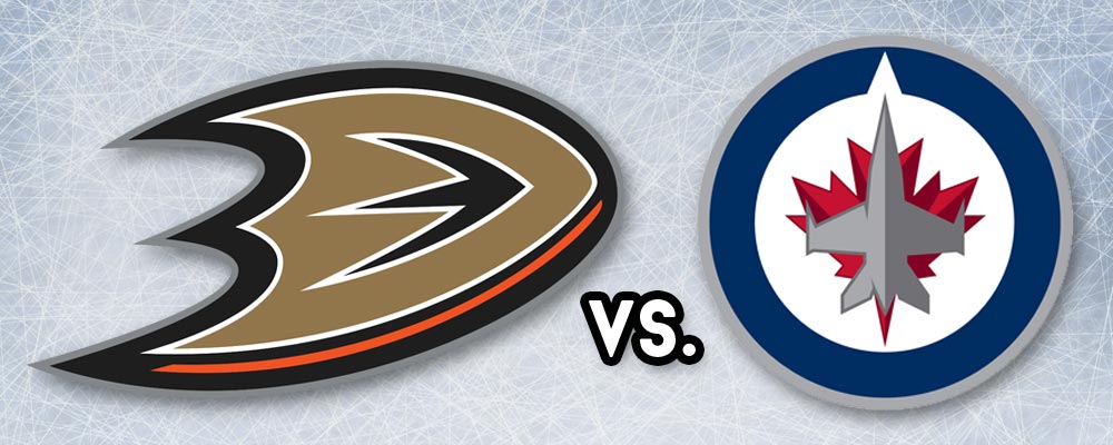
Anaheim Ducks vs. Winnipeg Jets

ANAHEIM – Man, this is just lazy. A webbed foot? Sure, they tried to make it look “speedy” but it still looks like nothing. They might have had a chance with the old school Disney “Mighty Ducks” logo and that sweet, sweet 90s teal color, but this is just sad. Emilio Estevez must be turning in his grave right now. His career grave, I mean.
WINNIPEG – Affiliated with bad ass military association (Royal Canadian Air Force) AND fast airplanes? And a little bit of maple leaf action in there for some added Canadianity? Win.
WINNER: WINNIPEG JETS
Sure I’m biased, but the Ducks logo sucks, so they were losing this round regardless of who they were up against.
Vancouver Canucks vs. Calgary Flames

VANCOUVER – I remember disliking this logo when it first came out. For some reason, I preferred the old logo, but now when I look at that old golden one, it looks like a pile of horse shit. This one has electricity and movement, and an orca that’s putting the “killer” in killer whale. Plus, I like the “C” incorporation as well as the Haida art influence. In retrospect, it’s quite good. I guess I was just a dum-dum back then. And now.
CALGARY – This one is simple, but I can give it a thumbs up. Simple, solid and implies action.
WINNER: VANCOUVER CANUCKS
It may seem like I’m against simplicity, but this was a tough call for me actually. I generally prefer beefier, bolder sports logos in bright colours because I think they’re more energetic, but I guess I’ve really come around on that Canucks logo. You’ve won this round, Vancouver.
Montreal Canadiens vs. Ottawa Senators
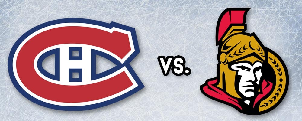
MONTRÉAL – Full disclosure: I have always inexplicably hated this logo. Not sure exactly why, it’s bold and pretty clean but it just annoys me on some level. And as for the team? THEY CAN’T EVEN SPELL ‘CANADIANS’ CORRECTLY! (I kid, I kid, please don’t beat me up, French people…)
OTTAWA – A Roman centurion? Enh, sure, why not? My issue with this one isn’t just the irrelevancy to the city, but the fact that the dude looks more defensive than ready to fight. He seems… wary.
WINNER: MONTRÉAL CANADIENS
Tough call on this one, but I’m handing it to Montréal. Grudgingly.
Tampa Bay Lightning vs. Detroit Red Wings

TAMPA BAY – This is simple, but eh, it works. A lightning bolt for the Lightning. Nothing that special, but it accomplishes what it set out to do.
DETROIT – VROOOOOOM… If Detroit is known for two things, it’s a deflated auto manufacturing industry and an oppressive bird population, amiright? No? Cars aren’t fast enough, so we put some wings on those babies! Come to think of it, this idea may be what collapsed the auto industry… Silliness aside, I kind of dig this logo still, it has a bit of a gladiator feel to it and some interesting detail without looking messy.
WINNER: DETROIT RED WINGS
Tampa Bay was just too plain to have a real dog in the hunt on this one. Godspeed.
New York Rangers vs. Pittsburgh Penguins

NEW YORK – Look at this garbage. Badly set type on a boring shield design. Looks like a Coast Guard flag. Shameful.
PITTSBURGH – I never realized until now just how poorly this is drawn. But it’s still a hockey playing penguin, so there was no way it was losing this round.
WINNER: PITTSBURGH PENGUINS
Pingu on skates can’t lose. At least in this round…
Washington Capitals vs. New York Islanders

WASHINGTON – Pfft. This connects poorly with Washington while it overconnects with hockey as a general concept. Baaaaasic.
NEW YORK – What, there’s another team from New York? Geeeeeeez. Now, objectively speaking, this is a horrible logo. Just hideous. It burns my eyes to look at it. But I still feel like the designer (or 7 year old child) tried harder than the person who designed the Capitals’ logo above. It probably wouldn’t have been so bad if they hadn’t jammed that janky Manhattan outline in there, but that’s what makes it special.
WINNER: NEW YORK ISLANDERS
It’s shitty. It’s uninspired. It’s unapologetically authentic. It moves on. Also, screw Ovechkin.
So those are my picks, stay tuned for round 2! And tell me what you think, have I got these down or should I be jerseyed and sent to the showers?
* Just remember, this is all in good fun, so let’s all be sportsmanlike. All opinions were meant in jest. And obviously I have zero NHL affiliation, images were just pulled for editorial commentary.